Using images in Informizely surveys
Informizely provides various ways for you to spice up the look of your surveys using images. You can use images in three ways:
- As background image for the survey widget.
- As a separate - optionally clickable - item on a survey page.
- Use multiple images for different choices displayed by image buttons.
Using a background image
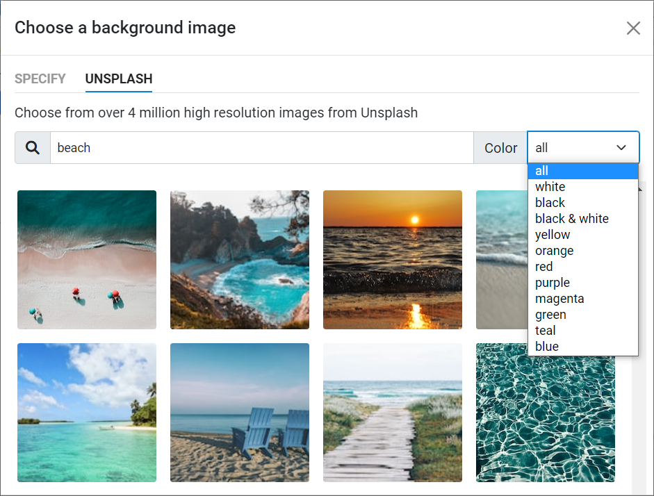
You can create beautiful looking surveys by specifying a background image for the survey widget. You can either use your own image, or select one from over 4 million high resolution images from unsplash.com.

To configure a background image for your survey in the survey builder, go to the "DESIGN" tab and "COLORS" sub-tab, and then click the button "Background image". A dialog appears where you can either specify a URL to an image, or - when you select the "UNSPLASH" tab - select an image from Unsplash. By default a selection of Unsplash images is shown, but you can enter any phrase in the search dialog to search for specific images. You can also search for images that contain a specific color by selecting a color from the color combobox.
When you select an Unsplash image or specify your own, the image will be loaded as background for the survey widget and shown in the survey preview. You can use the "Layout" and "Position" controls to finetune how the image will be shown on the background. By default the answer controls are shown with a transparent background on the image. You can select the level of transparency by tuning the "Alpha" value, where 0 is completely transparent and 255 is completely opaque. You can also turn off the option "Transparent fields" to show the answer controls with their normal background color.
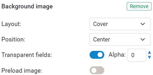
If you turn on the option "Preload image", the survey widget will not show until the background image has been loaded. This prevents a possible background change the first time this survey is shown if the image is not chached by the browser, but it may delay the survey's display time.
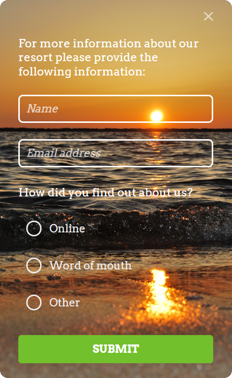
Adding image items to a survey page
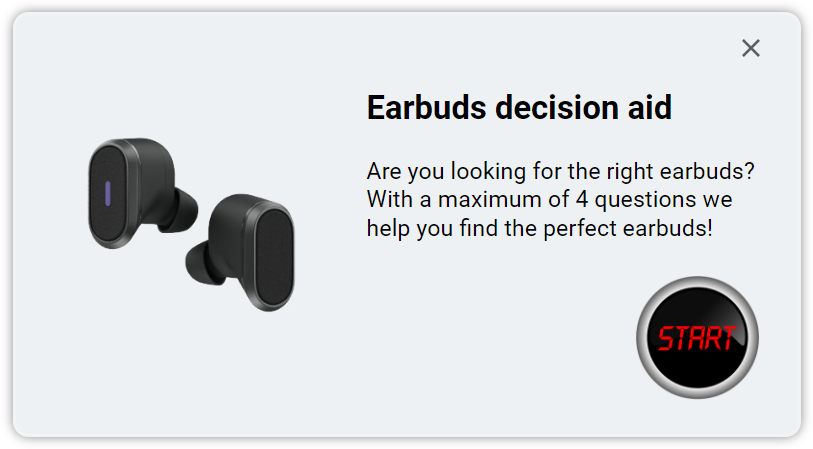
You can add any number of images to your survey pages. Optionally, an image can have a click action assigned to it, like the "START" button below.
To add an image to a survey page, go to your survey's "SCRIPT" tab, press the button named "Add an item to this page", and then select the item type "Image". A default image will be added as last item on the page (you can change this location by dragging it to a new location). You can then specify the URL where the image will be loaded from, or select an image from the image gallery.
An image can be positioned to the left or right of other items on the survey page, or inline. An inline image is shown as a normal item, below a possible previous item and above a possible following item.
By default, the width of the image is set to the maximum available width, while maintaining the original aspect ratio. If you want to set a fixed width and/or height for the image, change the "Size" from "Auto" to "Fixed dimensions". You can then also specify the horizontal alignment (left, right or center). Note that the width of the survey widget is set on the "DESIGN > SETTINGS" tab. If the image is positioned left or right from the other items you may want to adjust the width of the survey before setting an explicit image width or height.
Click actions
By default, an image is not clickable. If you want to, you can specify a "click action" for your image. There are four possible click actions:
- Open a URL, either in the current window or in a new window.
- Execute some JavaScript code when the image is clicked.
- End the survey.
- Go to a specified survey page.
If an image click opens a web page or executes JavaScript code, a survey response will always be registered, even when no questions are answered by the user. In the reporting dashboard the response will show the number of "call-to-actions" that were activated by the user.
Image loading
A survey that contains image items will only be shown when all of its images have finished loading. When the Informizely code is loaded on a web page,
it starts preloading all images of all surveys that can potentially be activated on the page, so that most images will probably have been loaded
when the survey needs to be shown.
In order to minimize the load time, we recommend to not use images that are much larger than needed
(a bit larger may be wanted, so that the image also looks good when the user has zoomed his browser).
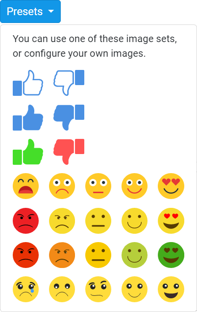
Image buttons
If a survey question ask the user to select one choice from multiple choices, you can use an item of type "radio buttons", "text buttons" or "dropdown". But if each choice can be represented by an image, you can also use the type "image buttons".
You can add any number of image buttons. You can configure the height
to which each image will be scaled (40 pixels by default). By default the images are displayed horizontally next to each other and wrapped around
if needed, but it's also possible to display the images vertically below each other.
By default a question mark icon will be shown for a button, as an indication that the image URL still needs to be configured.
Optionally you can add a click action to a button, for example to end the survey or to navigate to a specific survey page when clicked.
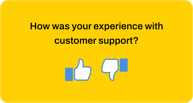
The "Presets" buttons offers various image sets that are ready for you to use, like the thums up and down in the example above.